Apple app icon sizes
| Platform | Size | Shape after masking | Appearances |
|---|---|---|---|
| iOS, iPadOS, macOS | 1024 × 1024 | Rounded square | Default, dark, clear and tinted |
| watchOS | 1088 × 1088 | Circle | Default |
| visionOS | 1024 × 1024 | Circle | Default |
| tvOS | 800 × 480 | Rounded rectangle | Default |
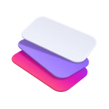
Apple's icons are layered: a background layer and one or more foreground layers, put together in Icon Composer, which comes with Xcode. You can still supply a flat PNG, and the system separates it into layers for the dark and tinted looks.
Google Play app icon
| Rule | Google Play |
|---|---|
| Size | 512 × 512 |
| Format | 32 bit PNG |
| Colour space | sRGB |
| File size | 1024 KB at most |
| Shape | A full square; Google Play rounds the corners to 30% of the size |
| Shadow | None; Google Play adds its own |
Google suggests a background colour with no transparency, so your icon doesn't take on the colour of the store around it.
Getting the icon right
- Supply square artwork and let each store round the corners. Pre-rounded corners look jagged once the system masks them.
- Keep the main shape in the middle, so nothing important is cut by the mask, especially on round Apple Watch and visionOS icons.
- Skip text unless it's part of your brand. It's tiny on the Home Screen and can't be translated.
- Leave out shadows, glows and bevels. Apple adds its own lighting to every layer, and Google adds its own shadow.
- Check your dark and tinted versions on iPhone: people choose how their Home Screen looks.